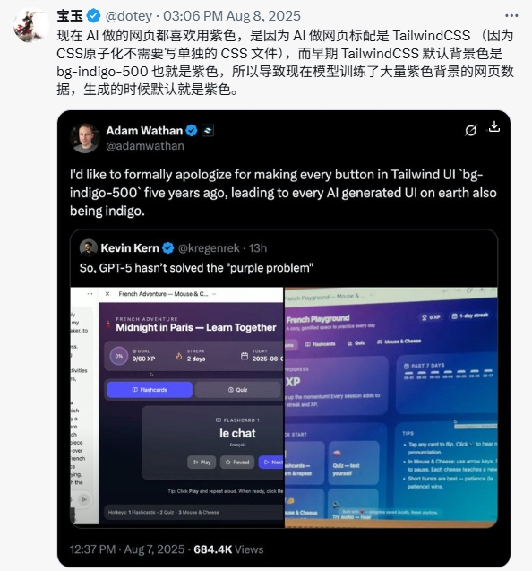
August 7, 2025, Adam Wathan, co-founder of Tailwind CSS, posted a seemingly casual apology tweet on X platform:
"I'd like to formally apologize for making every button in Tailwind UI use
bg-indigo-500five years ago, which caused every AI-generated interface on Earth to turn indigo."
This tweet quickly received 684,000 views, not only because of its self-deprecating humor but also because it revealed an unexpected technical phenomenon: AI-generated user interfaces commonly exhibit a "purple preference."

Specific manifestations of the phenomenon
Soon after, Kevin Kern further confirmed this phenomenon by replying to the tweet. He shared a screenshot of an AI-generated language learning app called "French Playground," where purple elements were everywhere—buttons and the overall color scheme. Kern joked: "So, GPT-5 hasn't solved the 'purple problem' yet."
This application belongs to the "Paris Midnight - Learn Together" project. Its flashcards and quizzes not only feature purple buttons but also have an entire design aesthetic centered around this hue, becoming a typical example of the "purple dilemma."

Technical causes: Unexpected bias in training data
August 8, X user dotey (@dotey) published a detailed analysis that uncovered the technical principles behind this phenomenon:
"Now, AI-generated websites all like to use purple because AI defaults to using Tailwind CSS for web design (because atomic CSS doesn't require separate CSS files)."
Tailwind CSS's "unintended mistake"
This all traces back to a design decision made five years ago by Tailwind CSS. As a utility-first CSS framework, Tailwind is known for its simple class name system:
bg-indigo-500: The "culprit" indigo background colortext-white: White textp-4: Padding settings
These predictable class names made Tailwind a favorite among AI tools because they are easy to understand and generate. However, this convenience led to unintended consequences.
The formation of a self-reinforcing cycle
The core of the issue lies in the composition of AI training data:
- Initial bias: Early websites widely used Tailwind's default purple configuration
- Data contamination: These purple interfaces became an important part of AI training data
- Pattern entrenchment: AI learned to associate "modern interfaces" with "purple"
- Cycle reinforcement: AI generates more purple interfaces, further "polluting" online content
As dotey pointed out, this created a "self-reinforcing cycle"—AI continuously replicated and amplified the early human design choices.
Community reactions: From confusion to realization
This phenomenon sparked widespread discussion in the tech community, with reactions ranging from confusion to realization:
The "Eureka" group:
- GNebula (@gyhjason): Thank you for the explanation, "No wonder AI designs always lean toward purple—I thought it was developers' default setting."
The humorous group:
- Liyan Tongzi (@TechMamiCom): Found this situation "too funny."
The rational analysis group:
- Sherry Li (@SherryLi233812): Noted that purple adds a "tech feel" to design.
Unexpected confirmation from color psychology
Interestingly, this "purple preference" somewhat aligns with color psychology principles. Purple has long been associated with the following traits:
- Creativity and innovation
- Technological feel and futuristic sense
- Mystery and intelligence
For AI-driven platforms, these traits are indeed fitting. However, the problem is that this choice was not based on design theory but rather on the unintended result of training data bias.
Technical impact and future outlook
Current challenges
This phenomenon reveals several key issues in AI-assisted design:
Risk of design homogenization: When all AI-generated interfaces tend toward similar color schemes, brand differentiation becomes difficult.
Training data quality: Over-reliance on certain frameworks or design patterns can lead to output results lacking diversity.
Innovation limitations: AI tends to replicate mainstream patterns in training data rather than explore new design possibilities.
Solution paths
Short-term strategies:
- Developers can guide AI to generate different color interfaces through more specific prompt engineering
- Perform manual adjustments and optimizations after AI generation
Long-term development:
- Build a more balanced and diverse training dataset
- Develop context-aware AI design systems
- Establish dynamic learning mechanisms based on user feedback
Conclusion: The butterfly effect of design decisions
Wathan's casual apology actually touched on a deep reality in modern technological development: seemingly minor early decisions may have unexpected long-term impacts when scaled up.
"The purple dilemma" is not just an interesting technical phenomenon, but also a reminder to the entire AI development community—we need to be more careful about the representativeness and diversity of training data. As next-generation models like GPT-5 develop, the tech industry is closely watching whether this "indigo legacy" will continue or give way to a richer design palette.
Until then, developers and AI enthusiasts might just have to accept this "purple haze"—at least it provides a vivid case showing how human design choices can be unexpectedly amplified and continued through machine learning models.

